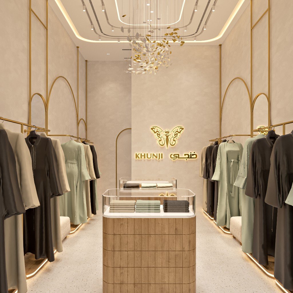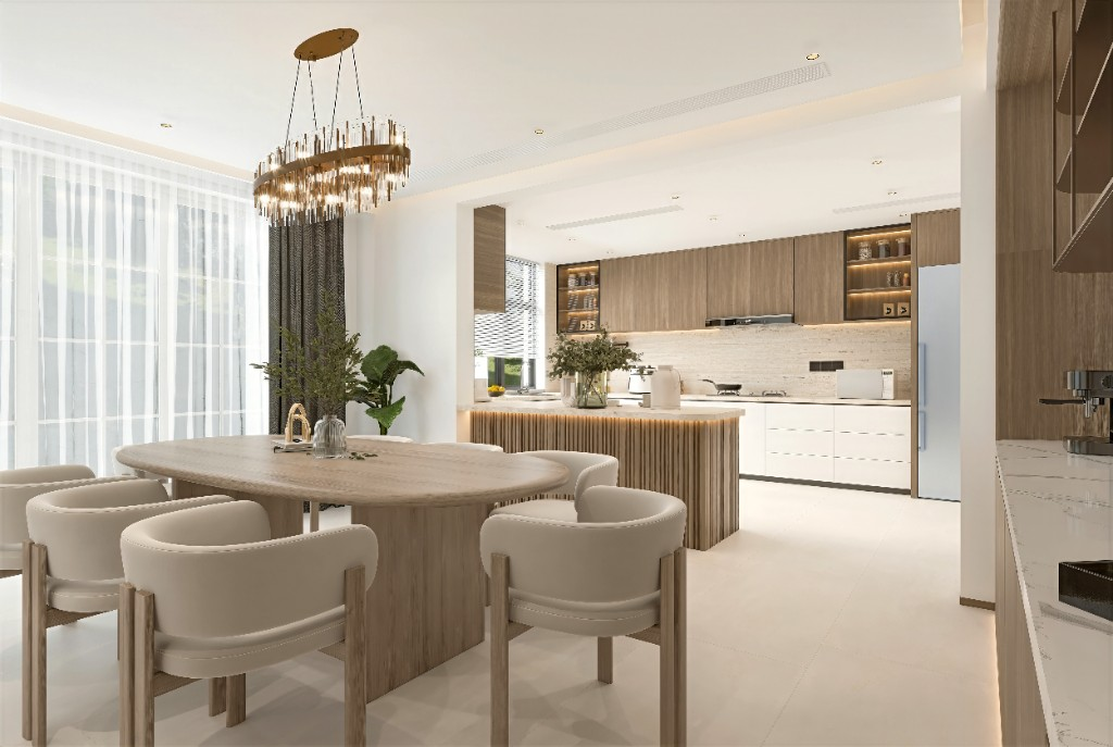
About Ideal Fitouts
Designed with Vision. Built with Precision.
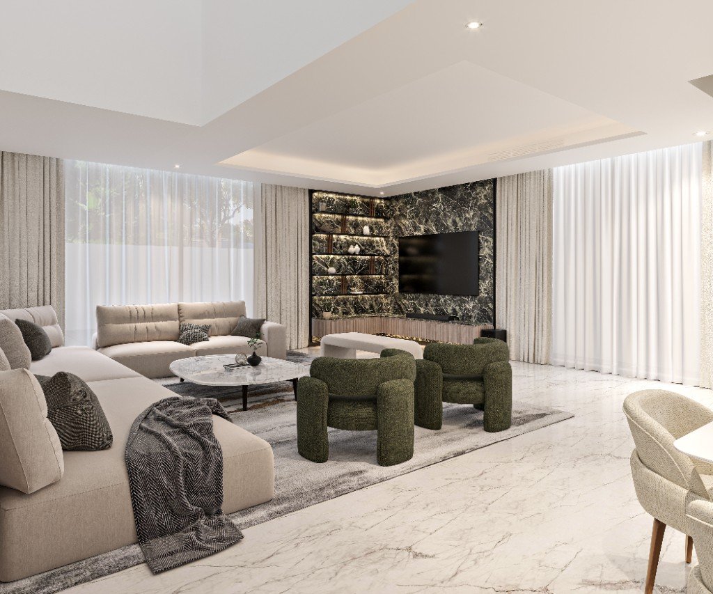
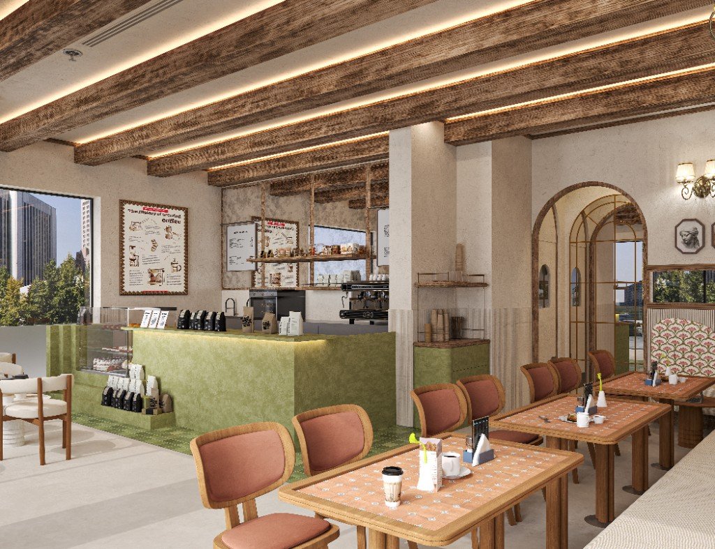
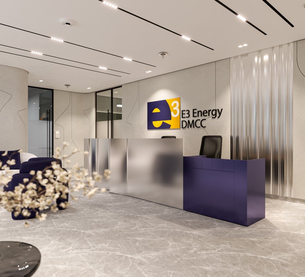
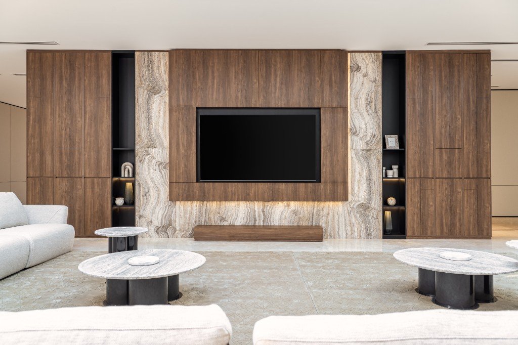
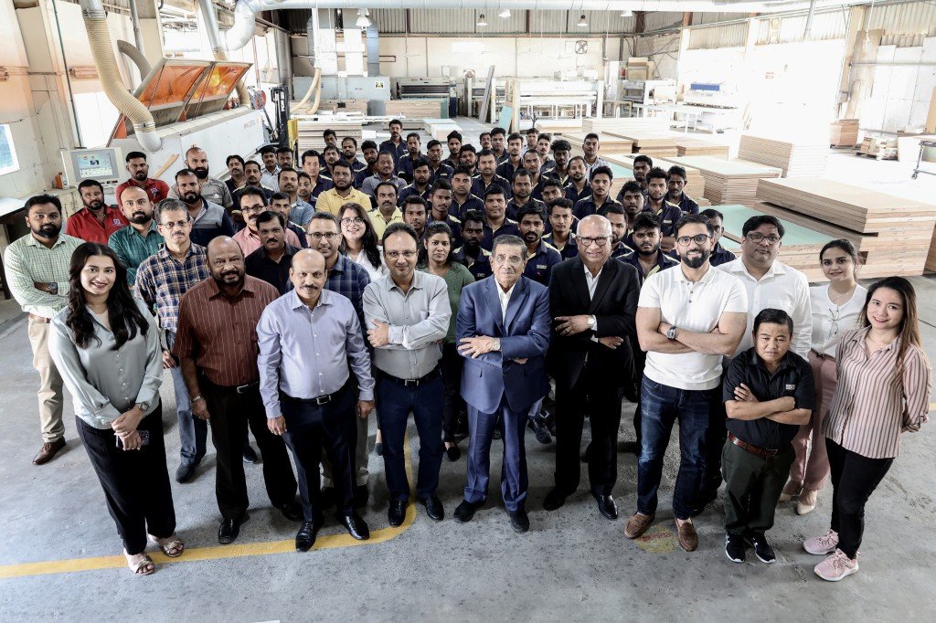
Ideal Fitouts LLC is the interior fit-out division of Ideal Group — a trusted Gulf-based conglomerate with over 20 years of industry experience. From our in-house manufacturing facility in Dubai, we provide complete design and build solutions for residential, commercial, hospitality, and retail spaces.
Our architects, interior designers, project managers, and craftsmen work together seamlessly to transform concepts into refined, functional environments — delivering every project with precision, quality, and attention to detail.
- ✓ In-house manufacturing facility with CNC and precision joinery capabilities
- ✓ Part of Ideal Group with over 20 years of regional expertise
- ✓ End-to-end design and build solutions under one roof
- ✓ Team of 120+ specialists across design, fabrication, and project delivery
- ✓ Expertise across residential, hospitality, retail, and workplace interiors